Thursday, August 12, 2010
Wednesday, August 11, 2010
Night Flowers

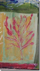
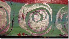
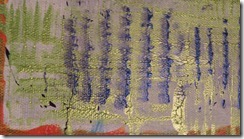
This painting was recently created by me at weekend art workshop. It started out as an abstract painting. The lines of color against the black background are the remains of the abstraction. Suddenly, after putting down some yellow ochre flowers started emerging and I went with the flow.
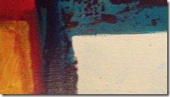
Here are some close-ups. Click on the images to have a bigger view.
Night Flowers
Tuesday, August 10, 2010
Inner landscapes: A brush with abstraction

Inner landscapes: A brush with abstraction
Australian Aboriginal Art
I just discovered this artist's blog the other day. She is great at what shes does and brings loads of insights and fascinating comments to her art and to art she has seen. Her post on Australian Aborignal Art is amazing. A must see!
Australian Aboriginal Art
Monday, August 2, 2010
Principles of design in two-dimensional design
Unity
Unity is described as an effect resulting from individual elements of a whole that are in harmony with each other. Moreover, all these elements support the overall design and feel like they belong together. Think of a woman whose makeup, clothing, jewellery, shoes and purse seem like they where made for each other. That’s unity.Most people find unity pleasing, because it implies order, a sense of organization and structure. To achieve it in your art, you need to select elements of design that belong together.
![MP900316897[1] MP900316897[1]](https://blogger.googleusercontent.com/img/b/R29vZ2xl/AVvXsEi5qgjjgGZm6Ab1vi75ANbfIpOmfv60c3GDylCdFuqCg1jkfgFaeHgS8DvI8bsQAgMC87NUGm9yG6IlzZSpzi7PbgcBhxKBpUVx5DR6vRfz8f9Z_wWd-ebmIVljD7FrlYRKAceUSt4PaCs/?imgmax=800)
What gives this picture a feeling of unity? Observe how the light shades of foliages are repeated in the foreground and background. The shade in the foliage in the foreground is repeated to the right of the image on the tree covered mountain. And the water in the foreground reflects the colors of the sky and the mountains in the background. Diagonal shapes are found in the mountains and in the layout of the water and the shrubbery. All of these elements work together to create a sense of unity.
Balance
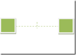
Balance in art is very similar to physical balance. Both imply a state of equilibrium or poise. In art, some combinations of lines, shapes and values are more pleasing are more pleasing than other, because they are balanced. The rules are simple, you want to keep things balanced. In order to achieve balance, you must consider the weight of the elements you have in your composition. The darker a value, the more weight it has. Similarly, the bigger the subject, the more weight it has. If you put to equal size objects at equal distance from the center of a picture, you have balance. If you add some weight to one side, you must compensate for the other. You can either move the the heavier subject closer to the middle or move the lighter object farther from the middle. Also, you can increase size or value to the lighter object so that both are in a state of equilibrium.Here are some examples:
Rhythm
Rhythm is created by repetition or progression of visual elements, and moves the viewer’s eye in interesting ways. To achieve this effect, you can create progressions in values (from light to dark), in colors (orange to red), or in sizes (small to large).Harmony
Harmony can be found in the middle of extremes. As an example, in a work of art, contrasts are desirable. But too much will create discord, and not enough will be monotonous.Emphasis
In a work of art, emphasis refers to the center of interest. The center of interest can be a color, a shape, an area, or anything else for that matter. Also, it doesn’t have to be in the middle of the picture plane, it can be located anywhere.Contrast
Contrast refers to putting together more than one elements that has different properties. To achieve contrast, you can use colors or emphasize an elements in the work of art by varying its size, shape, color or texture.Principles of design in two-dimensional design
Sunday, August 1, 2010
Man who sews…Are you loving it?
Man who sews…Are you loving it?
Friday, July 30, 2010
Your Thing Sucks (website)
First, check out this site, Your Thing Sucks, it’s useless, but I like it.
Second, here is some of his art, and it’s very entertaining art. He refers to these as “mechanical beasts”. My favourite one is the house cat.

I love how the Q-Tip has been identified as a it’s only weakness, the hairball repository, and the cheetah blood.

Wow, who knew it could be controlled at a distance and could take up to 6 bullets?
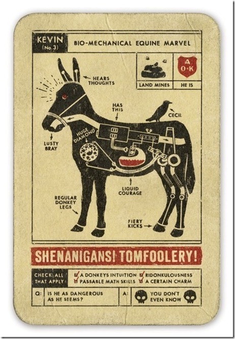
Next time you’re around a donkey, careful, they can hear your thoughts. Yikes. Ridonkulousness!

This weasel will stab you, steal you heart and your wallet, does he have no shame?
Check out more at http://www.ryanabegglen.com/index.html.
Your Thing Sucks (website)
Elements of design in two-dimensional design
I have put together a quick summary of elements of design for those of you curious, but not eager to get down with a 500 page book on two-dimensional design.
The first thing to learn about design is how to see like an artist. We all have a preconceived image of our world that has been created by our experiences.
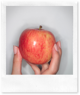
For example, take a piece paper and a pen and draw an apple right now before reading any further.
Now that you have drawn an apple, what does it look like? Is it perfect? Does it actually look like a real apple? Is it perfectly round, or wider at the top or middle? Is the stem in the middle or is it a bit to the side? Did you maybe forget to draw the small crevice from which the stem pops out of? And what about the bottom?
You most likely drew the symbol of an apple, but in reality it is much more complex. The trick is to look at an object as if it you were seeing it for the first time. Look for ways in which the subject isn’t what you expect.
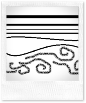
Lines: Lines do a lot. They defines edges, define space, create motion and energy or create a sense of volume and weight. They are straight, curved, diagonal, thick, thin continuous or even broken.
Something interesting to keep in mind is that lines also convey idea and sense. Flat horizontal lines create a sense of stability and restfulness. Vertical lines suggest strength and dignity. Diagonal lines have a feeling of motion, are more dynamic and energized. Curved line have a softer, more sensual quality.
Shapes: There isn’t much to say about shapes, but there are a couple points to remember. You can create them with lines, with colors or with tonal values. And often, we don’t actually see the shape we think we are seeing.
Often times, we will draw what makes sense to us, but not what we are actually seeing. A common mistake happens with cylinders. Imagine you where to look at one head on. What would it look like?
It probably would look like the rectangle. Are you confused? That’s because your brain is conditioned to see what it wants to see. When looking at a cylinder head on, you don’t see the top or the bottom.
Color: Since it stimulates the brain and the body, choice of color is always important. Warm colors create active and exciting responses, while cool colors create passive and calming responses.
Value describes the amount lightness or darkness of a color. A value halfway between the lightest and darkest values is called a middle value.
Texture: Texture is the feeling or the appearance of a given surface. It’s an important element of design, but don’t overemphasize it, because it will create a distraction to the viewer and might even misrepresent the surface you are trying to convey.
This assortment of fruits gives you an idea of the variety of different textures an artist deals with.
Pattern: Pattern must not be confounded with texture even though patterns can have textures. Pattern is the appearance of an organized design on a surface. Be careful, a pattern that is visually dominant will flatten out an image.
Nature has a full array of patterns that inspire us.

![MP900313830[1] MP900313830[1]](https://blogger.googleusercontent.com/img/b/R29vZ2xl/AVvXsEg7muIEW3o_33Pwg6RvMuZZLVtfYz2qlEue1LRr9NbYZYtUC2_7h69PX6zI7ssxxSQroFkDquo9LKqe2pNapQKgBaPO8csdBQtWVu-YgeMEe50XfIDgSAdNKypOd8E6RMwccjJKSa_iFR4/?imgmax=800)
![MP900403842[1] MP900403842[1]](https://blogger.googleusercontent.com/img/b/R29vZ2xl/AVvXsEi3sZ0esKHOhuk1sdvvd2rzyyCXc9BDXY7bFZKyDvaRpvE7SC9qZgYElkMxMfUZs_AI6C8Zdqe-eA1GDZ_catAJFq625eOxVyh7H1BUFYoRsaIouu3lgIy8UltLmYRcwKWdfoSR9iM6-qY/?imgmax=800)
![MP900406491[1] MP900406491[1]](https://blogger.googleusercontent.com/img/b/R29vZ2xl/AVvXsEj3dXLnhZdfRK1MPUCx0CSv_slmb2o1gZDa5wnUs2ohrwAqGJ7mllUfcx47gxB8LM9_vWEzoWxInGa1IESjjnc_nwRigElAStm-JrfTtuPMAO4BLfwJ9MxLn_TebEa6y3grPVvRfnw9hL4/?imgmax=800)
Texture and pattern should never override the shape, color, and value of an object.
Elements of design in two-dimensional design











![MP900387896[1] MP900387896[1]](https://blogger.googleusercontent.com/img/b/R29vZ2xl/AVvXsEgs8_lMBjxFLvB-ZVXab5jMRY4mYtMQWyvzuJMQZTTJ5mTKYkPhGDA4vB_9dzet4L4Za7_ri1HccsKZX0uiuNaZ44x7izjKlze1iBLZfZcpD8IF-4VhiAuhXg1neKEFifXPaesyis5Tm_c/?imgmax=800)
![MP900387895[1] MP900387895[1]](https://blogger.googleusercontent.com/img/b/R29vZ2xl/AVvXsEiz4mLBpqxQGfdLZfK0XpRC8wTVO403LWmbIf8uIWbceICeTc3ypsQ-j8FVVTqY7NpkrpuIqCKWSWfyq4e2nMMtnOm_cPzyGf6C6E034FkGZYOLF2-jJY7OwiarA-mOBF4bq_Qb6Lgq0g8/?imgmax=800)
![MP900387897[1] MP900387897[1]](https://blogger.googleusercontent.com/img/b/R29vZ2xl/AVvXsEj7cQBHBhJsjVGvo5f7TH1Tf22nMyk53exUyBN2Aewgvku4EvL0bK8q5jJVoUJ06ukjtu8hp1W51tbbItiKRyOGYiun_vT0qNN6H0EC7cY7WCNRui8cIXniPjz4k3EUhg4qcrZdYQVPbks/?imgmax=800)
![MP900387885[1] MP900387885[1]](https://blogger.googleusercontent.com/img/b/R29vZ2xl/AVvXsEhBIJN0T_bZK-oBePO7SqCeHsuBJUQdLsFblSdIQMDQQAyXDuuhdW9iLJtGuMNsphsebCor1yT391k5r2M-lBvRMQNDmitWZC1WarrptRdDZs7iJHMgmswrZxM_Eud3zs4v0FLzIFJmJZY/?imgmax=800)
![MP900387877[1] MP900387877[1]](https://blogger.googleusercontent.com/img/b/R29vZ2xl/AVvXsEjaRtFadgnEmPiprUn4DOOpA9zK7B8AfjWBiITmmvNGeUFU8QfnU7-YgQF-TpZn_q-jcQJ54iqGo610Mae3OdNw5VyQRwAhsfDxu7oLosp0JO_7aEZj0Na3KGOtUwo66zH49InuOh-xlyM/?imgmax=800)
![MP900387870[1] MP900387870[1]](https://blogger.googleusercontent.com/img/b/R29vZ2xl/AVvXsEhGzbIkRVwMC8BQUSbzOWNH5Ag1A56LOMe973Til0F6P9GKbBfffJCKbV2do5GQ8qaGXfJcOHmdG2tTxcfSBtf0YAWfDahA7aPF1rAJ66ws_WQFPTy_v_pq5-klb1jE1lwimmKpAzhd8Zs/?imgmax=800)
![MP900387873[1] MP900387873[1]](https://blogger.googleusercontent.com/img/b/R29vZ2xl/AVvXsEgOLW0YCCZywnakEAiniNKzXTBKeVvIIMZIKLgSYSTnMHxG6XsCQJ9OolzXLSovChgGpK8zGiQNVQsQSMYKSvLWJA2VErTzzKCz7f22Ru58aVgCbwqNJYZRzK__uCA6gwR-qE6fD7IcrCU/?imgmax=800)
![MP900387854[1] MP900387854[1]](https://blogger.googleusercontent.com/img/b/R29vZ2xl/AVvXsEjRAInTQYX1ftgafQ_hGplT4e8g0Naym0aF-NygGf9oHJHHrn75ayprVyxYLeVi1eAHHvht8NEK5KW6OK3SXkOdjFv8c_dnpVZD-HArSGG05DQzbnNMh8_y9s4eXvPEH-uSiAz2FtZRKPw/?imgmax=800)