Showing posts with label art. Show all posts

Tuesday, September 27, 2011

Mail Art


I just recently discovered Mail Art…and you guessed it, I just had to try out!  It`s a lot of fun.  But what is Mail Art? In a nutshell, it`s a postcard sized piece of art that you send in the mail to someone.
I did a lot of research and attended a workshop before creating all of these masterpieces that follow.  But this is what I retained as the most important: Anything goes!

Here are some ideas to get you started.  They are the ones that I used for making my Mail Art.

1. You need a postcard sized cardboard canvas.  Either 4x6 or 5x7 will do.

2. Your going to need paper, lot`s of it.  Magazines, books and scrapbooking paper are a good starting point.  Look for patterns or images that inspire you and rip them out (colors, textures, symbols).  Because your canvas is so tiny, only use small parts of whatever paper you have chosen (like 1x1 inch or a 0.5x2 inches strip of paper.

3.  Apply paper to canvas in a chaotic way.  Use acrylic medium to stick your paper to the canvas.  I worked with mat medium and gel medium.  Don`t forget you can put some color in your medium and create glazes.  Leave some negative spaces (empty spaces).

4. Optionally, use sanding paper once canvas is dry and roughen up some surfaces on the canvas.  The next coat of paint will react differently to the paper and create visual interest.

5. Finger-paint.  The paint can be opaque or it can be translucent (glaze or a wash). Make spots, stains or anything.  Wipe it off a bit with a paper towel, or not.  Create a distressed look by adding more pigment on the edge of the canvas.  Do what you feel like doing.

6. Next, find some words that represent your painting or that speak to you.  Then stamp them on your painting with letter stamps and Kraft ink (permanent ink).  Or stamp a saying.  You can also write with permanent ink pens. You can even stamp emboss a picture.  Be creative. 

7. Add more stamps, decorative elements, stickers, spray inks, doodles, etc.

8. Do the other side, but keep it cleaner to write a message and to write the address.

9. You have accomplished your own mail art masterpiece!
Remember that you can actually do what ever you feel like, and that these instructions by no means must limit your own style or creative pursuits. 

Now for the fun part: what I created!

Butterflies postcards - 4x6 cardboard canvas
These images are in sets of two (front and back).

Le FloristIMG_0178IMG_0179

Carte PostaleIMG_0182IMG_0184

Paris 1862IMG_0186IMG_0189

ExpositionIMG_0190IMG_0192

601
IMG_0194IMG_0197

402
IMG_0199IMG_0200

Excellentes saucesIMG_0203IMG_0204

Le boutonIMG_0206IMG_0209

Butterflies Series 6x8 (these are not postcards but where inspired by the ones I made).

L’HorizonIMG_0211

Petit moineauIMG_0213

Fleur de FromentIMG_0216

ChocolatIMG_0218

Confus MurmureIMG_0219

Tour EiffelIMG_0221

Materials used:
Paper: K&Company, Best of K&Company 12x12 designer pad
Paint: Golden, quinacridone red, quinacridone gold, Cadmium yellow medium hue, phthalo turquoise and unbleached titanium.
Spray Ink: Maya Mist in lime metallic and in sand metallic.
Stamps: Tim Holtz visual artistry, Stampin’ up, Hampton Art and Inkadinkadoo.
Stamp ink: Stampin’ up kraft stamp ink in chocolate.
Stickers: Tim Holtz idea-ology salvage stickers in Crowded Attic.
Designer tape: Tim Holtz

Hope you enjoyed.  Happy Mail Art Making!
Krysthle Poitras
Share/Bookmark

Saturday, August 6, 2011

Painting whimsical animals


Here are some ideas that you can take to create whimsical animal paintings.  The imperfectness of the painting is what makes it so enchanting. Happy accidents become interesting features and clashing colors convey a sense of whimsy.  For each painting I have done, I give examples of techniques that can be used to achieve a similar look.
P6190002
L’ornithologue (the ornithologist)
Draw the outline of your animal with a hot glue gun.  Exaggerate some of the features.  Once dry, draw over the glue with permanent felts in various colors.  Draw in certain sections of the animal with oil pastels.  Don`t be afraid to mix up the colors.  When finished, paint over the oil pastels with acrylic paints.  Once dry, scratch designs into your animal such as feathers, fur, doodles, etc.  Afterwards, finger paint the negative space surrounding your animal.  Leave approximately half an inch to an inch of space between your animal and the finger paint.  This will frame your subject.  Add a glaze or a wash of color over the entire negative space.  Finish off by touching up a few features.
P6190007
Minou volant (flying kitty)
First thing, your going to need a piece of paper and a pencil.  Think of the animal you would like to paint.  Now try simplifying the animal down to two or three lines.  One line is even better.  In this painting, I simplified down to two closed lines: the body and the face.  Once you’ve got your shape down, prepare the background of your painting by tearing up strips of paper and applying them to the canvas.  It can be paper from an old book, a magazine of maybe even gift paper.  Inspiring yourself from the paper you have just chosen, use a hint of color in the white paint that will be apply to cover the entire background.  It can be opaque or translucent.  Now you can draw the simplified version of your animal with a charcoal or lead pencil.  Paint your animal with the colors of your choice and work the background creatively by inspiring yourself from the shapes and colors of the strips of paper that have been applied previously to the canvas.  Smudge oil pastel on painting and etch designs in it if you want.  You could also stamp the background and play up empty vs. full spaces.
P6190008
Ma belle Chanelle (My beautiful Chanelle)
Use the glue gun technique again, but paint the outline instead of drawing it with permanent felt pens.  To create the background, use soft gel and apply a thick coat with a painting knife, making sure to create a lot of texture.  Paint animal with acrylics and add doodles.  When background is dry add a few washes of colors.  The texture will prevent the paint from drying uniformly, creating an interesting background.  Finally, the clouds where painted on which the cat is sitting and the doodles repeated.
P6190006
Bulles de rêves, bulles de chats (Dream bubbles, cat bubbles)
Again, the glue gun technique is used and the rest was painted using acrylics.
Share/Bookmark

Wednesday, April 27, 2011

Mix media: Working with metals

This is a work of art that I made last fall.  I`m finally getting around to posting it!  I really enjoyed trying these new techniques: embossing metal, hand carving in metal, adding metal elements to canvas, using metallic felts and shaping metal wire.

I really enjoyed creating this one. It was full of new discoveries. This is a semi-abstract painting about a forest.  And its all about exploring texture in metal.

Metal Forest
 Here is a side view so that you can get an idea of how dimensional it is.  You can really see how the green metal wire pops out of the canvas.

Sideview
 This next picture shows parts of the two metals pieces that I embossed using an embossing tool. I added little details such as the little circles in the middle of the lozenge by poking the underside of the metal with the round end of a needle.  Careful: if you press to hard, you`ll make a hole!  I also added metallic colored paint on the metal.  To make it adhere better, I had to sand it down a little.  The second metal piece (bottom one) was also embossed using an embossing tool and painted with metallic colors.

Closeup
I made this ''fleur de lys'' using a stencil and a crayon-like embossing tool.  I followed the edges of the stencil, and chose not to fill in the middle.  I also punched out a hole in each corner.  To adhere the metal plate to the canvas I used a glue gun.  Once it dried, I colored over the glue with a permanent gold metallic felt.  I really love how it looks.

Closeup
This next picture shows the trunks of the trees and some grass growing in front of the tree line.  The trees were also cut with normal scissors and then embossed. I made sure to emboss in different directions to create some diversity.  I put the trees against the lighter side of the background to create a greater contrast.
The bottom grass background was created by embossing with a tool and the grass itself was hand carved out of the metal.  I lightly added paint to the grass to contrast with the background.

Closeup
Finally, I added these four metal pieces which are eyelets into the canvas.  I really liked the glue on the ''fleur de lys'', so I put some around the eyelets too.  I added a touch of gold glitter glue in the middle, and some stars over the forest were created.  I also added some wired mesh under the green wire.  This has an aesthetic function as well as a practical function.  I needed something to keep the wire in place.

Closeup

Hope you enjoyed!

Krysthle Poitras
Share/Bookmark

Monday, April 25, 2011

Black and white: cells and planets

I've been painting as usual.  I just finished taking a creative class called : Black and White, cells and planets.  It was fun even though black and white isn`t really my thing!

These two next mix-media paintings are my favorite ones.  The first is called "Puckered up" because it reminds me of a little puckered up face.  Maybe after eating a really sour candy?  I used string gel to create those smooth and unbroken white circle lines.  Also, I used several different types of fabric and paper to create the circles.  The objective was to create texture.  This painting was also just an exercise, but it turned out great!


Puckered up
  This next one was created over a previous exercise that I had done when exploring textures and materials.  I really didn't like the exercises end result.  I also had a lot of leftovers from cutting so many circles out of all these papers I used for another painting.  I figured that one ugly exercise + a lot of left over paper could = something interesting.  Indeed, it turns out that this is one of my favorite mix-media paintings ever! 

I really like how things from the exploration/exercise I did peer out from under all that paper.  I also like it because it's really 3D.  I call it "Squares and Cells".

Squares and cells

This next one is called "Comet", and if you haven't guessed why, it's because of the frilly tail that is located under the circle.  Now you might have a hard time figuring out the shape of this one, it's because the circle does indeed poke out of the canvas.


Comet

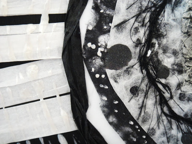
The closup reveals the materials used: some frilly ribon, fiber paper, some black and white lace papers, and black and white paper ribon.  I also used the string gel with some pearl colored acrylic paint over the white paper ribbon.


Comet closeup
This next one is called "The sheep". It"s pretty self-explanotory.


The Sheep

I put this closeup so that you may see the material used.  It's really paper maché material that hasen't been soaked in water.  To make it stay put, I put some acrylic medium over it.

The sheep closeup

This painting is called "Three little moons", because it reminds me of a planet with three moons in the sky.  An interesting tidbit about his painting is that I intentionally left some lace paper peer out from the edges.

Three little moons

And the last painting is called "Three little cells".  I used so many different kinds of paper to do the cells, which is what makes it neat.

Three little cells

Hope you enjoyed!
Krysthle Poitras


Share/Bookmark

Friday, November 19, 2010

Religious Icon Self-Portrait

This one did not start out to be a religious icon.  Actually, I was just painting my hair in geometric forms, and someone pointed out to me that it kind of looked like those windows in churches, like a religious icon.  I have since redone the hair, maybe like 3 or 4 times.  Had to get it perfect.  I have to say that I’m not a deeply religious person, so this it’s kind of funny to me to look at this one.  Some people who know me well might think this is a parody of religion.  It is whatever YOU want it to be.  To me, it’s just another painting that took an interesting twist!

religious icon big
Share/Bookmark

Thursday, November 18, 2010

Tryptic Self-Portrait

Lately, I created tryptic self-portrait.  I really like the concept of having three images to form a whole.  It all came together out of the blue (pun intended: notice that I used a lot of blue in it).  I went shopping at a local art supplier (DeSerres: http://www.desseres.ca/) and found these beautiful blue large format papers.
large format paper 2large format paperlarge format paper 3
As well, I had raided a wallpaper book by Ralph Lauren and found this lovely wall covering with New York buildings, sites and landmarks.  I additionally found two scrapbooking pages that where in theme with what I was doing, so I cut them up and did this big collage with all the material I found.  And the result:
tryptic 1
tryptic 2
673_3706
Here are some close-ups of my favourite details from the tryptic.
Postal cards:
little details I like 4 little details I like 1
Landmark and two ladies, one peering from behind my hair:
little details I like 2little details I like 6 little details I like 3
And the cool large format papers I was talking about, here are 4 kinds, and a piece of scrapbook paper with an old feel to it.
little details I like 5

Share/Bookmark