Monday, November 7, 2011

Patchwork Flowers


So it’s been a while.  I`m so busy crafting greeting cards for Christmas bazaars that I don’t get too much time to  write anymore.  I was reminded today of my blog when someone in class asked me if I had a blog (if I can remember right?).  Any how, here are two mix-media works of art I made on October 30, 2011.  See my previous post on metal working for details on techniques: http://community.art-is-fun.com/profiles/blogs/mixmedia-working-with-metals.

Also, see all my artwork on The-Art-Colony.com at this link:  http://community.art-is-fun.com/photo/photo/listForContributor?screenName=3vrtp265ey2u3

So here it is. Patchwork Flowers.  I`m currently working on watercolour paintings for the first time in 15 years (a.k.a. since I was a kid).  I`m taking a 5 class workshop and the theme is flowers.  I’m really inspired right now by flowers, so I figured that i would continue.  And I found some time to sneak in a day of mix-media while I was down with a bad cold.  Nothing make you more ‘zen’ than creating something.  And so I created!  It’s a great way to relax and let go of life’s obstacles, such as my cold.  After that day I was exhausted, but also re-energized and peaceful as always, after a day of creating.

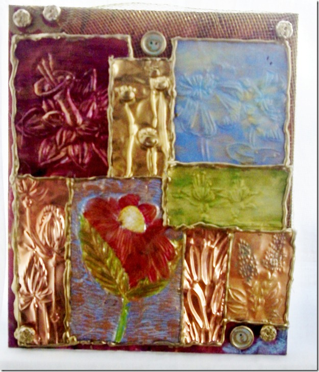
Patchwork Flowers 1 (I wasn’t feeling creative to name my art, maybe I’ll change the name later), is exactly as the title indicates.  A patchwork of flower embossed metal.  I was thinking of a quilt when I made these two compositions.

Here are some pictures. 

674_5859


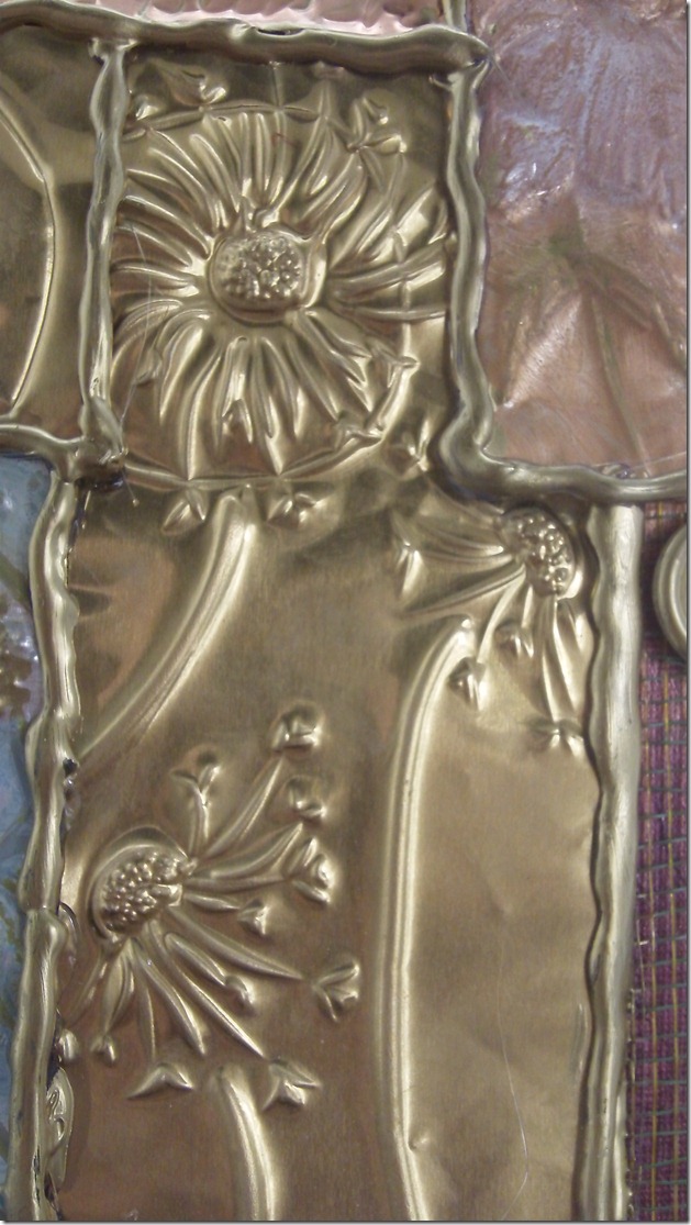
here are some close-ups so that you can see the embossing or de-bossing work.

Pansies and poppies.

674_5860

674_5861

Cat tails and lupines

674_5865


Here Patchwork Flowers 2

674_5858

And the close-ups:

Sideview

674_5866

Pansies and writing

674_5867

Flower clusters

674_5869

Daffodil

674_5868

Dead dandelions

674_5870

You might have noticed that I incorporated some non-metal materials.  I put in wood buttons, which I altered using paint, pastels and permanent gold felt markers.  I also added fabric mesh to the background.  This was hard to do because I didn’t want any glue to show.  I had to stretch it and glue in the back.  The back id such a mess….but the front is lovely! I also incorporated flower plastic buttons which I altered using those same felt markers mentioned above.


Tootles,

Krysthle

P.S. Visit my new paper crafts website at www.krysthle.com.

Share/Bookmark

Tuesday, September 27, 2011

Mail Art


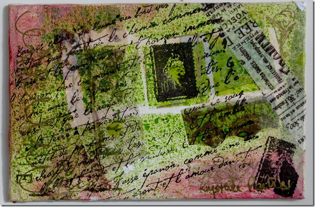
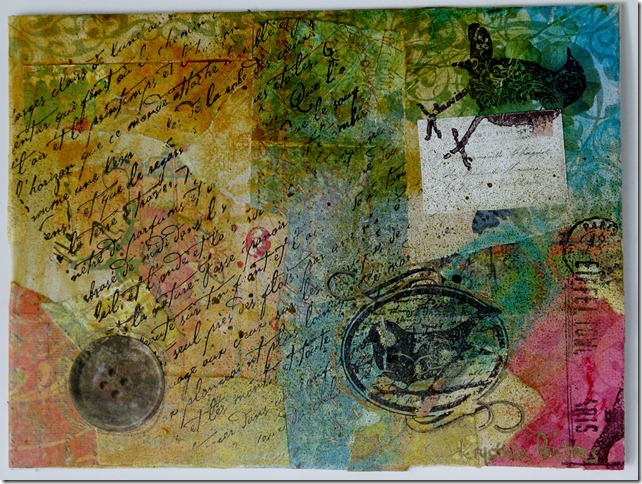
I just recently discovered Mail Art…and you guessed it, I just had to try out!  It`s a lot of fun.  But what is Mail Art? In a nutshell, it`s a postcard sized piece of art that you send in the mail to someone.
I did a lot of research and attended a workshop before creating all of these masterpieces that follow.  But this is what I retained as the most important: Anything goes!

Here are some ideas to get you started.  They are the ones that I used for making my Mail Art.

1. You need a postcard sized cardboard canvas.  Either 4x6 or 5x7 will do.

2. Your going to need paper, lot`s of it.  Magazines, books and scrapbooking paper are a good starting point.  Look for patterns or images that inspire you and rip them out (colors, textures, symbols).  Because your canvas is so tiny, only use small parts of whatever paper you have chosen (like 1x1 inch or a 0.5x2 inches strip of paper.

3.  Apply paper to canvas in a chaotic way.  Use acrylic medium to stick your paper to the canvas.  I worked with mat medium and gel medium.  Don`t forget you can put some color in your medium and create glazes.  Leave some negative spaces (empty spaces).
4. Optionally, use sanding paper once canvas is dry and roughen up some surfaces on the canvas.  The next coat of paint will react differently to the paper and create visual interest.

5. Finger-paint.  The paint can be opaque or it can be translucent (glaze or a wash). Make spots, stains or anything.  Wipe it off a bit with a paper towel, or not.  Create a distressed look by adding more pigment on the edge of the canvas.  Do what you feel like doing.

6. Next, find some words that represent your painting or that speak to you.  Then stamp them on your painting with letter stamps and Kraft ink (permanent ink).  Or stamp a saying.  You can also write with permanent ink pens. You can even stamp emboss a picture.  Be creative. 

7. Add more stamps, decorative elements, stickers, spray inks, doodles, etc.

8. Do the other side, but keep it cleaner to write a message and to write the address.

9. You have accomplished your own mail art masterpiece!
Remember that you can actually do what ever you feel like, and that these instructions by no means must limit your own style or creative pursuits. 

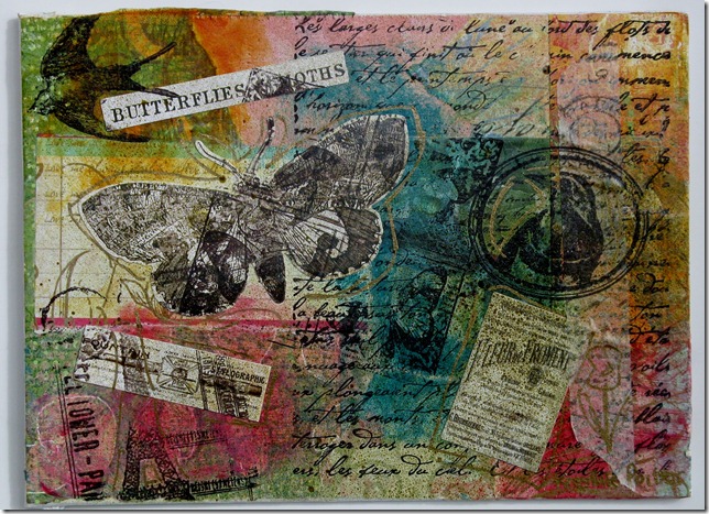
Now for the fun part: what I created!

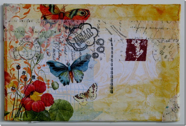
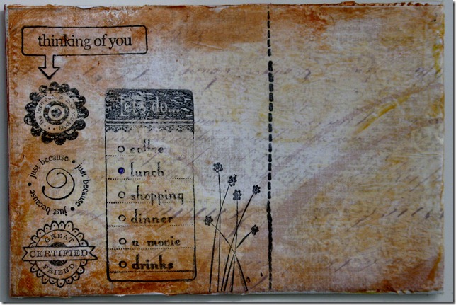
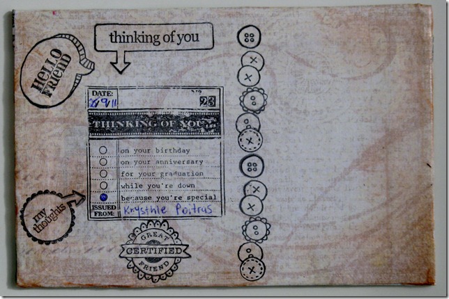
Butterflies postcards - 4x6 cardboard canvas
These images are in sets of two (front and back).

Le FloristIMG_0178IMG_0179

Carte PostaleIMG_0182IMG_0184

Paris 1862IMG_0186IMG_0189

ExpositionIMG_0190IMG_0192

601
IMG_0194IMG_0197

402
IMG_0199IMG_0200

Excellentes saucesIMG_0203IMG_0204

Le boutonIMG_0206IMG_0209

Butterflies Series 6x8 (these are not postcards but where inspired by the ones I made).

L’HorizonIMG_0211

Petit moineauIMG_0213

Fleur de FromentIMG_0216

ChocolatIMG_0218

Confus MurmureIMG_0219

Tour EiffelIMG_0221

Materials used:
Paper: K&Company, Best of K&Company 12x12 designer pad
Paint: Golden, quinacridone red, quinacridone gold, Cadmium yellow medium hue, phthalo turquoise and unbleached titanium.
Spray Ink: Maya Mist in lime metallic and in sand metallic.
Stamps: Tim Holtz visual artistry, Stampin’ up, Hampton Art and Inkadinkadoo.
Stamp ink: Stampin’ up kraft stamp ink in chocolate.
Stickers: Tim Holtz idea-ology salvage stickers in Crowded Attic.
Designer tape: Tim Holtz

Hope you enjoyed.  Happy Mail Art Making!
Krysthle Poitras
Share/Bookmark

Scrapbooking layout ideas

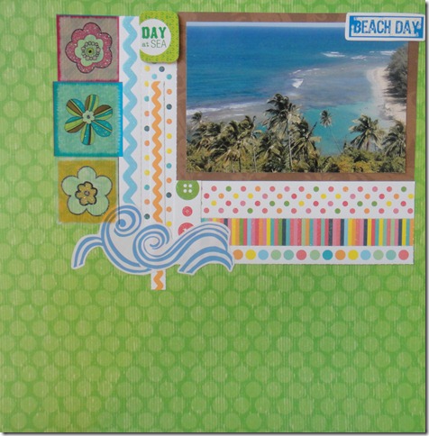
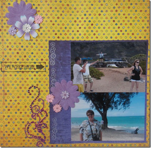
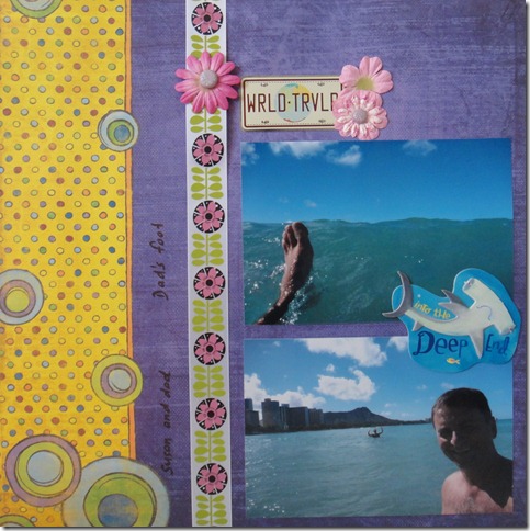
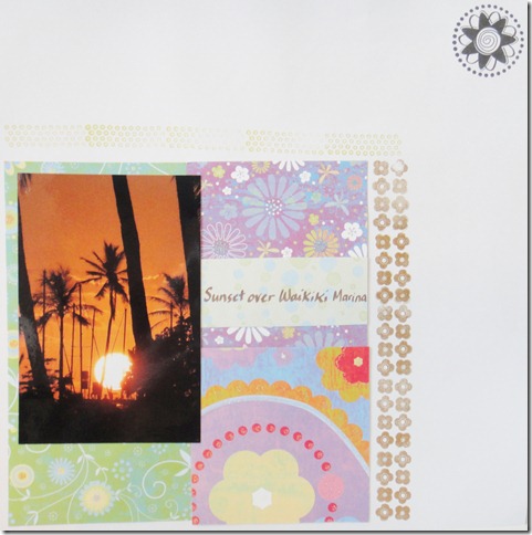
Ok, last of the layouts that I did on Hawaii to show you.  I made these layouts after spending too much money at Michaels.  I was so inspired by all the new loot I had gotten that I went crazy!  Beautiful summer colors, bling, and new supplies are so much fun!  A lot of these materials are from Recollections, Martha Stewart and Prima.

DSC00378

DSC00379

DSC00382

DSC00384
Happy Scrapbooking!
Krysthle
Share/Bookmark

Scrapbooking layouts ideas

I have been so busy over the past few months scrapbooking and making cards that I haven`t had much time to do many blogs.  I still have several layouts that I made to show you.  After that, in the coming weeks, I will be showing you some cards that I made, some Christmas cards too (for sale!), and a blog on Art Mail (so cool!).

These are some layouts that I made a while back, but maybe they can give you some ideas on clustering embellishments.  I tried different layouts and different clusters to see what would be nice.  At the time, I really liked these layouts, but my style has evolved quite a bit since.


All materials used in these layouts are from Creative Memories.
Happy scrapbooking!
Krysthle
Share/Bookmark

Sunday, August 21, 2011

Scrapbook layouts: title pages


Title pages are a fun way to present the content that follows in your scrapbooks.  Because I had visited three islands in Hawaii, I made three title pages.  I have already showcased two of these layouts previously, but I wanted to talk about title pages today.
DSC00370
Idea: Use a fun chipboard die cut or sticker as the focal point of your title page. 
Idea: Use fun stamps.  Here I used travel themed stamps.
Idea: use glitter letters to attract attention to your title.
DSC00348
Idea: All out of letter? Handwrite your title by hand or using a stencil.
Idea: Raid your scrap stash for small pieces of scraps to write on.  It gives a cheery and happy feel to the layout.
Idea: Use that ribbon that you don`t know what to do with.  With all the colors, something is bound to match.
DSC00338
Idea: Put a picture that you fell represents the title or section to come.
Idea: Missing a letter? Add one that doesn't match, it looks fun and it looks like it’s on purpose!

Hope you enjoyed,
Krysthle Poitras
Share/Bookmark

Scrapbook layouts


New layouts to share with you.  These where made a while back.  I was trying out new products that I had just purchased.
DSC00367
Idea: Add some matching bling to your layout.  Bling is always fun to look at!
DSC00368
Idea: Put a flower and a brad on top of ribbon.  I used colors that match the ribbon flowers.  It adds a little unexpected touch.
DSC00369
Idea: Experiment with stamping.  Although I didn’t achieve the look I was going for, I still enjoyed playing with these new stamps that I had purchased for a dollar each!  You can use stamps to frame a picture or frame the page.
Hope you enjoyed,
Krysthle Poitras
Share/Bookmark

Monday, August 15, 2011

Scrapbook layouts and ideas


New summer layout ideas.
DSC00361
If you have three pictures that you would like to put into the same layout, this is a fantastic way to arrange them.  Put your favourite one in the middle.  Make sure that the ones you put on the side don`t cut off anything important.  Notice how I chose to use pictures where I was in the inner corner.
DSC00362
Paper piercings are fun to make and cheap too!  I made this summer out two different coloured papers.  Also had these fun sandal stickers, so I made them into a footprint border.
DSC00363
This is a pretty busy layout.  It looks a bit crooked, but that only because my picture-taking skills need some work.  The layout is actually very straight and proportionate.  I had left over strips of yellow paper, so I made them into a background for the `happy`sticker.
DSC00364
This last layout is also busy.  I used three photo corners to create an accent in the upper right corner. I also did this on another layout in a previous blog, but with smaller corners and more of them.  I also clustered some flowers.  Finally, I made a mistake when spelling `Hanauma Bay`, so I re-wrote it on blue cardstock and put it over the mistake.  Great way for covering up mistakes, and it looks like I did it on purpose!

Hope you enjoyed,
Krysthle Poitras
Share/Bookmark