I have put together a quick summary of elements of design for those of you curious, but not eager to get down with a 500 page book on two-dimensional design.
The first thing to learn about design is how to see like an artist. We all have a preconceived image of our world that has been created by our experiences.
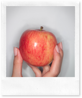
For example, take a piece paper and a pen and draw an apple right now before reading any further.
Now that you have drawn an apple, what does it look like? Is it perfect? Does it actually look like a real apple? Is it perfectly round, or wider at the top or middle? Is the stem in the middle or is it a bit to the side? Did you maybe forget to draw the small crevice from which the stem pops out of? And what about the bottom?
You most likely drew the symbol of an apple, but in reality it is much more complex. The trick is to look at an object as if it you were seeing it for the first time. Look for ways in which the subject isn’t what you expect.
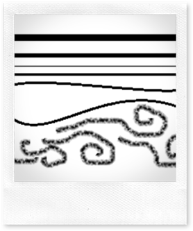
Lines: Lines do a lot. They defines edges, define space, create motion and energy or create a sense of volume and weight. They are straight, curved, diagonal, thick, thin continuous or even broken.
Something interesting to keep in mind is that lines also convey idea and sense. Flat horizontal lines create a sense of stability and restfulness. Vertical lines suggest strength and dignity. Diagonal lines have a feeling of motion, are more dynamic and energized. Curved line have a softer, more sensual quality.
Shapes: There isn’t much to say about shapes, but there are a couple points to remember. You can create them with lines, with colors or with tonal values. And often, we don’t actually see the shape we think we are seeing.
Often times, we will draw what makes sense to us, but not what we are actually seeing. A common mistake happens with cylinders. Imagine you where to look at one head on. What would it look like?
It probably would look like the rectangle. Are you confused? That’s because your brain is conditioned to see what it wants to see. When looking at a cylinder head on, you don’t see the top or the bottom.
Color: Since it stimulates the brain and the body, choice of color is always important. Warm colors create active and exciting responses, while cool colors create passive and calming responses.
Value describes the amount lightness or darkness of a color. A value halfway between the lightest and darkest values is called a middle value.
Texture: Texture is the feeling or the appearance of a given surface. It’s an important element of design, but don’t overemphasize it, because it will create a distraction to the viewer and might even misrepresent the surface you are trying to convey.
This assortment of fruits gives you an idea of the variety of different textures an artist deals with.
Pattern: Pattern must not be confounded with texture even though patterns can have textures. Pattern is the appearance of an organized design on a surface. Be careful, a pattern that is visually dominant will flatten out an image.
Nature has a full array of patterns that inspire us.

![MP900313830[1] MP900313830[1]](https://blogger.googleusercontent.com/img/b/R29vZ2xl/AVvXsEg7muIEW3o_33Pwg6RvMuZZLVtfYz2qlEue1LRr9NbYZYtUC2_7h69PX6zI7ssxxSQroFkDquo9LKqe2pNapQKgBaPO8csdBQtWVu-YgeMEe50XfIDgSAdNKypOd8E6RMwccjJKSa_iFR4/?imgmax=800)
![MP900403842[1] MP900403842[1]](https://blogger.googleusercontent.com/img/b/R29vZ2xl/AVvXsEi3sZ0esKHOhuk1sdvvd2rzyyCXc9BDXY7bFZKyDvaRpvE7SC9qZgYElkMxMfUZs_AI6C8Zdqe-eA1GDZ_catAJFq625eOxVyh7H1BUFYoRsaIouu3lgIy8UltLmYRcwKWdfoSR9iM6-qY/?imgmax=800)
![MP900406491[1] MP900406491[1]](https://blogger.googleusercontent.com/img/b/R29vZ2xl/AVvXsEj3dXLnhZdfRK1MPUCx0CSv_slmb2o1gZDa5wnUs2ohrwAqGJ7mllUfcx47gxB8LM9_vWEzoWxInGa1IESjjnc_nwRigElAStm-JrfTtuPMAO4BLfwJ9MxLn_TebEa6y3grPVvRfnw9hL4/?imgmax=800)
Texture and pattern should never override the shape, color, and value of an object.


![MP900387896[1] MP900387896[1]](https://blogger.googleusercontent.com/img/b/R29vZ2xl/AVvXsEgs8_lMBjxFLvB-ZVXab5jMRY4mYtMQWyvzuJMQZTTJ5mTKYkPhGDA4vB_9dzet4L4Za7_ri1HccsKZX0uiuNaZ44x7izjKlze1iBLZfZcpD8IF-4VhiAuhXg1neKEFifXPaesyis5Tm_c/?imgmax=800)
![MP900387895[1] MP900387895[1]](https://blogger.googleusercontent.com/img/b/R29vZ2xl/AVvXsEiz4mLBpqxQGfdLZfK0XpRC8wTVO403LWmbIf8uIWbceICeTc3ypsQ-j8FVVTqY7NpkrpuIqCKWSWfyq4e2nMMtnOm_cPzyGf6C6E034FkGZYOLF2-jJY7OwiarA-mOBF4bq_Qb6Lgq0g8/?imgmax=800)
![MP900387897[1] MP900387897[1]](https://blogger.googleusercontent.com/img/b/R29vZ2xl/AVvXsEj7cQBHBhJsjVGvo5f7TH1Tf22nMyk53exUyBN2Aewgvku4EvL0bK8q5jJVoUJ06ukjtu8hp1W51tbbItiKRyOGYiun_vT0qNN6H0EC7cY7WCNRui8cIXniPjz4k3EUhg4qcrZdYQVPbks/?imgmax=800)
![MP900387885[1] MP900387885[1]](https://blogger.googleusercontent.com/img/b/R29vZ2xl/AVvXsEhBIJN0T_bZK-oBePO7SqCeHsuBJUQdLsFblSdIQMDQQAyXDuuhdW9iLJtGuMNsphsebCor1yT391k5r2M-lBvRMQNDmitWZC1WarrptRdDZs7iJHMgmswrZxM_Eud3zs4v0FLzIFJmJZY/?imgmax=800)
![MP900387877[1] MP900387877[1]](https://blogger.googleusercontent.com/img/b/R29vZ2xl/AVvXsEjaRtFadgnEmPiprUn4DOOpA9zK7B8AfjWBiITmmvNGeUFU8QfnU7-YgQF-TpZn_q-jcQJ54iqGo610Mae3OdNw5VyQRwAhsfDxu7oLosp0JO_7aEZj0Na3KGOtUwo66zH49InuOh-xlyM/?imgmax=800)
![MP900387870[1] MP900387870[1]](https://blogger.googleusercontent.com/img/b/R29vZ2xl/AVvXsEhGzbIkRVwMC8BQUSbzOWNH5Ag1A56LOMe973Til0F6P9GKbBfffJCKbV2do5GQ8qaGXfJcOHmdG2tTxcfSBtf0YAWfDahA7aPF1rAJ66ws_WQFPTy_v_pq5-klb1jE1lwimmKpAzhd8Zs/?imgmax=800)
![MP900387873[1] MP900387873[1]](https://blogger.googleusercontent.com/img/b/R29vZ2xl/AVvXsEgOLW0YCCZywnakEAiniNKzXTBKeVvIIMZIKLgSYSTnMHxG6XsCQJ9OolzXLSovChgGpK8zGiQNVQsQSMYKSvLWJA2VErTzzKCz7f22Ru58aVgCbwqNJYZRzK__uCA6gwR-qE6fD7IcrCU/?imgmax=800)
![MP900387854[1] MP900387854[1]](https://blogger.googleusercontent.com/img/b/R29vZ2xl/AVvXsEjRAInTQYX1ftgafQ_hGplT4e8g0Naym0aF-NygGf9oHJHHrn75ayprVyxYLeVi1eAHHvht8NEK5KW6OK3SXkOdjFv8c_dnpVZD-HArSGG05DQzbnNMh8_y9s4eXvPEH-uSiAz2FtZRKPw/?imgmax=800)
No comments:
Post a Comment